

Matplotlib Tutorial in Python
In this series of Matplotlib Tutorials in Python, we will cover all the concepts from beginners to expert level. Starting with how to install Matplotlib library to how to create the plots, this series is an exhaustive tutorial and by the end of this series you will be able to create most of the plot types.
What is Matplotlib?
Matplolib is a plotting library which is used to generate 2D figures/graphs from data in Python. It is extensively used in data sciences as it produces high quality images which can be used in publication also. It can be used in Python scripts, the Python and IPython shells, the Jupyter notebook, web application servers etc.
How to install Matplotlib?
The easiest way to install Matlplotlib library in Python is using the standard package manager of Python i.e. pip. So, simply typing ‘pip install matplotlib’ in terminal/command line (MacOS/Unix) or PowerShell(Windows) will install it on your MacOS/Linux/Windows PC.
$ pip install matplotlib
Install Matplotlib using third party distributions
Alternatively, you can install Matplotlib library in Python using the third party scientific distributions like Anaconda, Canopy, ActiveState, etc. for MacOS, Windows and major linux platforms. On Windows, you have another distribution called WinPython, which can be used to install Matplotlib. If you are using miniconda, then you can use ‘conda install matplotlib’ to install the library.
How to install Matplotlib on Linux using package manager?
You can install Matplotlib on major distributions of Linux OS by using the package manager as detailed in the table below:-
| # | Linux Distribution | Command |
|---|---|---|
| 1 | Debian/Ubuntu | sudo apt-get install python3-matplotlib |
| 2 | Fedora | sudo dnf install python3-matplotlib |
| 3 | Red Hat | sudo yum install python3-matplotlib |
| 4 | Arch | sudo pacman -S python-matplotlib |
Create a simple line plot in Python using Matplotlib
We can create a simple line plot in Python using matplotlib.pyplot.plot() method.
Syntax of matplotlib.pyplot.plot()
The syntax for plt.plot() is :-
matplotlib.pyplot.plot(\*args, scalex=True, scaley=True, data=None, \*\*kwargs)
It returns a list of Line2D objects representing the plotted data. And, the basic parameters of pyplot.plot() are as shown in the table below:-
| # | Parameters | Type | Details |
|---|---|---|---|
| 1 | x, y | array-like or scalar | The horizontal / vertical coordinates of the data points. x values are optional and default to range(len(y)). Commonly, these parameters are 1D arrays. They can also be scalars, or two-dimensional (in that case, the columns represent separate data sets). These arguments cannot be passed as keywords. |
| 2 | fmt | str, optional | A format string, e.g. 'ro' for red circles. See the Notes section for a full description of the format strings. Format strings are just an abbreviation for quickly setting basic line properties. All of these and more can also be controlled by keyword arguments. This argument cannot be passed as keyword. |
| 3 | data | indexable object, optional | An object with labelled data. If given, provide the label names to plot in x and y. |
We can create a simple line chart as under:-
- Create an empty file matplotlib_tutorial.py and start editing it in your favourite editor. (I like to use Sublime Text as my editor). You can read more about the editors/shell here.
- Import matplotlib.pyplot.
- I have taken age-wise data of Indian population in a Python list from here.
- Then we will pass two lists to plt.plot() method as x-axis and y-axis.
- Finally, we will create a line plot using plt.show().
import matplotlib.pyplot as plt #This is the general convention

ages = [12, 13, 14, 15, 16, 17, 18, 19, 20, 21]

total_population = [27877307, 24280683, 25258169, 25899454, 24592293, 21217467, 27958147, 20859088, 28882735, 19978972]

plt.plot(ages, total_population)
plt.show()
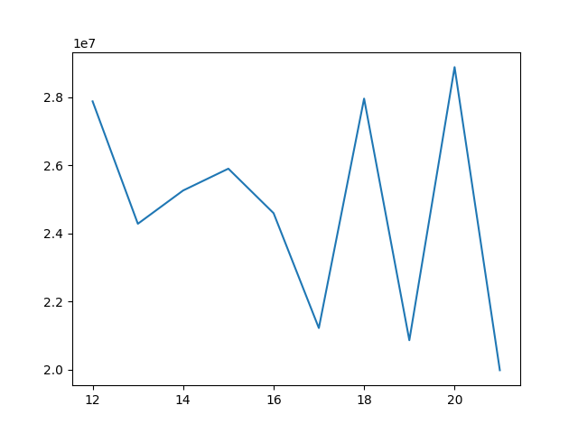
As you can see in the above line plot, the x-axis denotes the ages and the y-axis denotes the total population. Even, the simple Line chart comes with so many inbuilt functions:-
- Home Button - It takes back to the home/basic position, if you have used other options and moved/zoomed/panned your plot.
- Left Arrow - It moves the plot left-wards.
- Right Arrow - It moves the plot right-wards.
- Pan - It helps you to move the plot by panning.
- Zoom- It helps you to select a rectagular portion of the map and zoom into it.
- Configuration tool - It is used to set top/bottom/left/right padding and width and height space.
- Save - It saves the plot as a png at your desired location.
How to set title and axis-labels in a Matplotlib Plot?
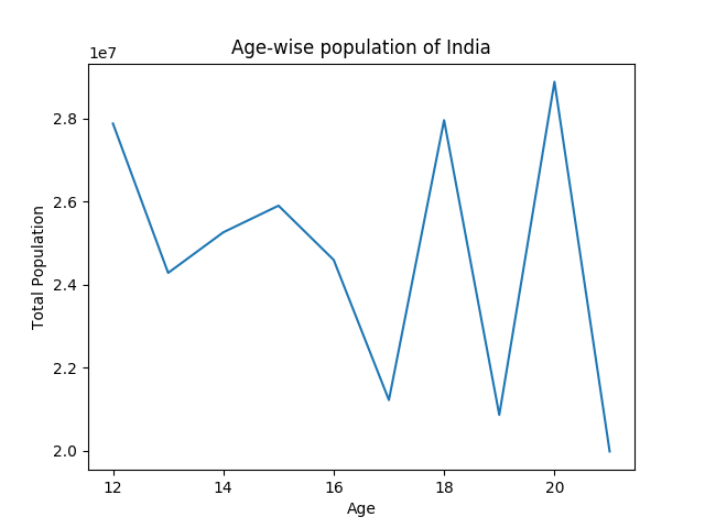
We can further customize our Matplotlib Plots and add title and axis-labels to the chart by using plt.xlabel(), plt.ylabel(), plt.title() before plt.show()
plt.xlabel("Age")
plt.ylabel("Total Population")
plt.title("Age-wise population of India")
plt.show()
Just by using the above options, our Plot has more information vis-a-vis a title and axes-labels.
Positioning the title of the Matplotlib Plot
By default pyplot.title() position the title above the plot at the very center but you can position it by passing loc = {‘center’, ‘left’, ‘right’} in pyplot.title() method.
Creating Multiple Line Plots in Python using Matplotlib
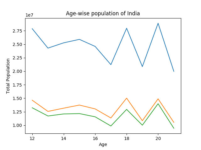
We can also create multiple line plots in Python using Matplotlib by passing the data to plt.plot() method. The line plots will share the x-axis and y-axis but will have different data/values.
# matplotlib_tutorial.py
# Male Population
male_population = [14637892, 12563775, 13165128, 13739746, 13027935, 11349449, 15020851, 10844415, 14892165, 10532278]
#Female Population
female_population = [13239415, 11716908, 12093041, 12159708, 11564358, 9868018, 12937296, 10014673, 13990570, 9446694]
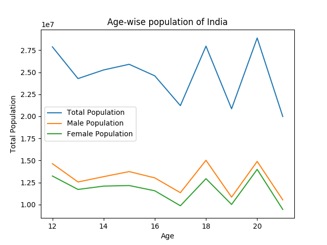
plt.plot(ages, total_population)
plt.plot(ages, male_population)
plt.plot(ages, female_population)
Matplotlib will automatically set different colors for the multiple line plots.
Adding legends to the Matplotlib Plot in Python
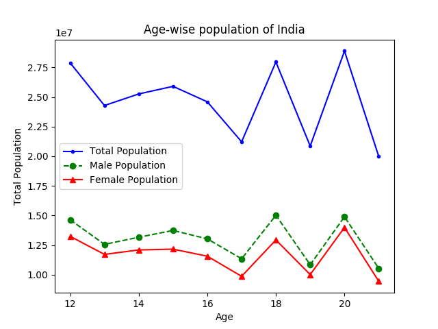
Though all the three plots above are of different color, but still it is not clear, what each plot represents. So, we can easily add legends to our plot by passing labels in plt.plot() method and calling plt.legend():-
# matplotlib_tutorial.py

plt.plot(ages, total_population, label = "Total Population")
plt.plot(ages, male_population, label = "Male Population")
plt.plot(ages, female_population, label = "Female Population" )
plt.legend()
plt.show()
Setting position of the legends in Matplotlib
The matplotlib library will automatically place the legends at the best location (as per the library) but we can change the location of the legend by passing loc to plt.legend(). The permissible location strings and location codes for ‘loc’ parameter of plt.legend() are as under:-
| # | Location String | Location Code |
|---|---|---|
| 1 | 'best' | 0 |
| 2 | 'upper right' | 1 |
| 3 | 'upper left' | 2 |
| 4 | 'lower left' | 3 |
| 5 | 'lower right' | 4 |
| 6 | 'right' | 5 |
| 7 | 'centre left' | 6 |
| 8 | 'center right' | 7 |
| 9 | 'lower center | 8 |
| 10 | 'upper center' | 9 |
| 11 | 'center' | 10 |
Setting Markers, line-style and colors of the charts in Matplotlib Plot
You can also set the markers, line-style and colors of the Matplotlib Plot by using the format method. The details of the same can be found here
Setting up the markers, line-style and colors of the plot is as easy as providing the following format in plt.plot() method.
# matplotlib_tutorial.py

fmt = '[marker][line][color]'
Markers in Matplotlib
You can choose from the following markers :-
| # | Character | Description |
|---|---|---|
| 1 | '.' | point marker |
| 2 | ',' | pixel marker |
| 3 | 'o' | circle marker |
| 4 | 'v' | triangle_down marker |
| 5 | '^' | triangle_up marker |
| 6 | '<' | triangle_left marker |
| 7 | '>' | triangle_right marker |
| 8 | '1' | tri_down marker |
| 9 | '2' | tri_up marker |
| 10 | '3' | tri_left marker |
| 11 | '4' | tri_right marker |
| 12 | 's' | square marker |
| 13 | 'p' | pentagon marker |
| 14 | '*' | star marker |
| 15 | 'h' | hexagon1 marker |
| 16 | 'H' | hexagon2 marker |
| 17 | '+' | plus marker |
| 18 | 'x' | x marker |
| 19 | 'D' | diamond marker |
| 20 | 'd' | thin_diamond marker |
| 21 | '|' | vline marker |
| 22 | '_' | hline marker |
Line Styles in Matplotlib
The available line styles in Matplotlib are :-
| # | character | description |
|---|---|---|
| 1 | '-' | solid line style |
| 2 | '--' | dashed line style |
| 3 | '-.' | dash-dot line style |
| 4 | ':' | dotted line style |
Colors in Matplotlib
The supported color abbreviations in Matplotlib are the single letter codes:-
| # | character | color |
|---|---|---|
| 1 | 'b' | blue |
| 2 | 'g' | green |
| 3 | 'r' | red |
| 4 | 'c' | cyan |
| 5 | 'm' | magenta |
| 6 | 'y' | yellow |
| 7 | 'k' | black |
| 8 | 'w' | white |
If the color is the only part of the format string, you can additionally use any matplotlib.colors spec, e.g. full names (‘green’) or hex strings (‘#008000’).
Now, let us add these features i.e. markers, line-style and colors to our Matplotlib plot.
# matplotlib_tutorial.py
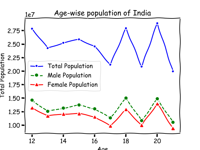
plt.plot(ages, total_population, '.-b', label="Total Population")
plt.plot(ages, male_population, 'o--g', label="Male Population")
plt.plot(ages, female_population, '^-r', label="Female Population")
We will get the following Matplotlib Plot with markers, line-styles and colors:-
However, if you find the above notation less-readable and want your code to be more explicit, you can pass all these arguments-marker, linestyle and color to plt.plot() method. The following code will produce the same plot:-
# matplotlib_tutorial.py

plt.plot(ages, total_population, color='b', linestyle='-', marker='.', label="Total Population")
plt.plot(ages, male_population, color='g', linestyle='--', marker='o', label="Male Population")
plt.plot(ages, female_population, color='r', linestyle='-', marker='^', label="Female Population")
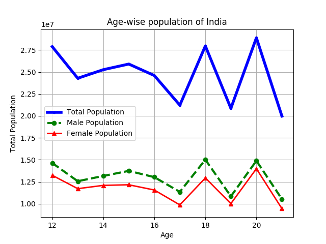
Adding grids and setting line-width of Matplotlib Plots
We can easily set the linewidth of the plot by passing linewidth, which takes a float as argument, to plt.plot().
Also to make plot more readable, we can add grids to our Matplotlib plot by passing plt.grid().
# matplotlib_tutorial.py

plt.plot(ages, total_population, color='b', linestyle='-', marker='.', linewidth=4, label="Total Population")
plt.plot(ages, male_population, color='g', linestyle='--', marker='o', linewidth=3, label="Male Population")
plt.plot(ages, female_population, color='r', linestyle='-', marker='^', linewidth=2, label="Female Population")
plt.grid()
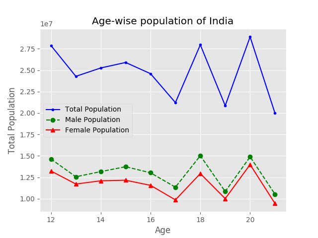
Using inbuilt plot styles in Matplotlib
There are many inbuilt styles in Matplotlib, which can be used to style your plots. To get the list of the available styles:-
print(plt.style.available)

# Output
['seaborn-dark', 'seaborn-darkgrid', 'seaborn-ticks', 'fivethirtyeight', 'seaborn-whitegrid', 'classic', '_classic_test', 'fast', 'seaborn-talk', 'seaborn-dark-palette', 'seaborn-bright', 'seaborn-pastel', 'grayscale', 'seaborn-notebook', 'ggplot', 'seaborn-colorblind', 'seaborn-muted', 'seaborn', 'Solarize_Light2', 'seaborn-paper', 'bmh', 'tableau-colorblind10', 'seaborn-white', 'dark_background', 'seaborn-poster', 'seaborn-deep']
So, we can use the in-built styles of matplotlib by simply using the plt.style.use(). :-
plt.style.use('ggplot')
Matplotlib Style- ggplot (Example)
Matplotlib Style- xkcd (Example)
You can also draw plots with the comic style of xkcd by simply passing plt.xkcd() instead of plt.style.use().
Saving the Matplotlib plot as an image
Instead of using the save button on the matplotlib plot, you can directly save the Matplotlib plot as image directly from the code by using plt.savefig(‘yourfilename.png’).
plt.savefig('myplot.png') #this will save the plot in the current directory.
plt.savefig('path\to\my\directory\myplot.png') # this will save the plot to the desired directory.
Matplotlib Tutorial in Python - Introduction, Installation and Line Plots - Video Tutorial
If you have liked our tutorial, there are various ways to support us, the easiest is to share this post. You can also follow us on facebook,twitter and youtube.
In case of any query, you can leave the comment below.
In the next chapter , we will learn about extracting data from csv (instead of passing lists) and bar charts.
Table of Contents of Matplotlib Tutorial in Python
Matplotlib Tutorial in Python | Chapter 1 | Introduction
Matplotlib Tutorial in Python | Chapter 2 | Extracting Data from CSVs and plotting Bar Charts
Pie Charts in Python | Matplotlib Tutorial in Python | Chapter 3
Matplotlib Stack Plots/Bars | Matplotlib Tutorial in Python | Chapter 4
Filling Area on Line Plots | Matplotlib Tutorial in Python | Chapter 5
Python Histograms | Matplotlib Tutorial in Python | Chapter 6
Scatter Plotting in Python | Matplotlib Tutorial | Chapter 7
Plot Time Series in Python | Matplotlib Tutorial | Chapter 8
Python Realtime Plotting | Matplotlib Tutorial | Chapter 9
Matplotlib Subplot in Python | Matplotlib Tutorial | Chapter 10
Python Candlestick Chart | Matplotlib Tutorial | Chapter 11
If you have liked our tutorial, there are various ways to support us, the easiest is to share this post. You can also follow us on facebook, twitter and youtube.
In case of any query, you can leave the comment below.
If you want to support our work. You can do it using Patreon.