

Scatter Plot in Python using Pandas and Matplotlib
In this tutorial we will learn to create a Scatter Plot in Python using Matplotlib and Pandas. We will use matplotlib.pyplot()’s plt.scatter() to create the scatter plot
What is a Scatter Plot?
Scatter Plot also known as scatter plots graph, scatter graphs, scatter chart, scatter diagram is used to show the relationship between two sets of values represented by a dot. It helps in finding the co-relation between the values and also help in identifying the outliers. Scatter Plots are an effective way of Data Visualisation in Python.
The syntax and the parameters of matplotlib.pyplot.scatter
The syntax of plt.scatter() is :-
matplotlib.pyplot.scatter(x, y, s=None, c=None, marker=None, cmap=None, norm=None, vmin=None, vmax=None, alpha=None,
linewidths=None, verts=<deprecated parameter>, edgecolors=None, \*, plotnonfinite=False, data=None, \*\*kwargs)
And the parameters are:-
| Serial | Parameter | Type | Description |
|---|---|---|---|
| 1 | x,y | scalar or array-like, shape (n, ) | The data positions. |
| 2 | s | scalar or array-like, shape (n, ), optional | The marker size in points**2. Default is rcParams['lines.markersize'] ** 2. |
| 3 | c | color, sequence, or sequence of colors, optiona | The marker color. Possible values:
Note that c should not be a single numeric RGB or RGBA sequence because that is indistinguishable from an array of values to be colormapped. If you want to specify the same RGB or RGBA value for all points, use a 2-D array with a single row. Otherwise, value- matching will have precedence in case of a size matching with x and y. Defaults to None. In that case the marker color is determined by the value of color, facecolor or facecolors. In case those are not specified or None, the marker color is determined by the next color of the Axes' current "shape and fill" color cycle. This cycle defaults to rcParams["axes.prop_cycle"] (default: cycler('color', ['#1f77b4', '#ff7f0e', '#2ca02c', '#d62728', '#9467bd', '#8c564b', '#e377c2', '#7f7f7f', '#bcbd22', '#17becf'])). |
| 4 | marker | MarkerStyle, optional | The marker style. marker can be either an instance of the class or the text shorthand for a particular marker. Defaults to None, in which case it takes the value of rcParams["scatter.marker"] (default: 'o') = 'o'. See markers for more information about marker styles. |
| 5 | cmap | Colormap, optional, default: None | A Colormap instance or registered colormap name. cmap is only used if c is an array of floats. If None, defaults to rc image.cmap. |
| 6 | norm | Normalize, optional, default: None | A Normalize instance is used to scale luminance data to 0, 1. norm is only used if c is an array of floats. If None, use the default colors.Normalize. |
| 7 | vmin, vmax | scalar, optional, default: None | vmin and vmax are used in conjunction with norm to normalize luminance data. If None, the respective min and max of the color array is used. vmin and vmax are ignored if you pass a norm instance. |
| 8 | alpha | scalar, optional, default: None | The alpha blending value, between 0 (transparent) and 1 (opaque). |
| 9 | linewidths | scalar or array-like, optional, default: None | The linewidth of the marker edges. Note: The default edgecolors is 'face'. You may want to change this as well. If None, defaults to rcParams["lines.linewidth"] (default: 1.5). |
| 10 | edgecolors | {'face', 'none', None} or color or sequence of color, optional. | The edge color of the marker. Possible values:
|
| 11 | plotnonfinite | boolean, optional, default: False | Set to plot points with nonfinite c, in conjunction with set_bad. |
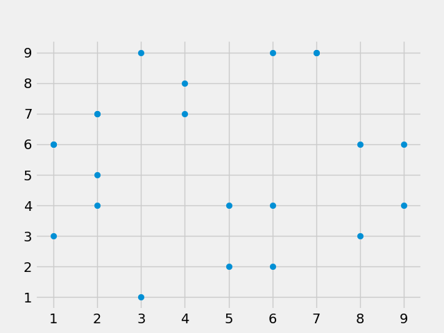
Creating a Simple Scatter Plot in Python using Matplotlib
We can create a simple scatter plot in Python by passing x and y values to plt.scatter():-
# scatter_plotting.py

import matplotlib.pyplot as plt

plt.style.use('fivethirtyeight')

x = [2, 4, 6, 6, 9, 2, 7, 2, 6, 1, 8, 4, 5, 9, 1, 2, 3, 7, 5, 8, 1, 3]
y = [7, 8, 2, 4, 6, 4, 9, 5, 9, 3, 6, 7, 2, 4, 6, 7, 1, 9, 4, 3, 6, 9]


plt.scatter(x, y)
plt.show()
This code will create a simple scatter plot in python. We can also use seaborn style to create seaborn scatter plot.
Customizing the Scatter Plots in Python Matplotlib
We can customize the scatter plot by passing certain arguments in plt.scatter(). Some of the commonly used options to customize the scatter plot in python are as under:-
- s - it represents the size of the marker of the scatter plot and it takes integer size. Higher the value of s, higher the size of the marker in the scatter diagram.
- alpha- sets opacity/tranparency of the markers of the scatter plot. take values from 0 to 1.
- c - color of the marker of scatter plot. Can provide color names, hexa colors etc.
- edgecolor - color of the border of the marker of the scatter plot.
- linewidth - width of the border of the marker of the scatter plot.
- marker - set different kinds of markers.
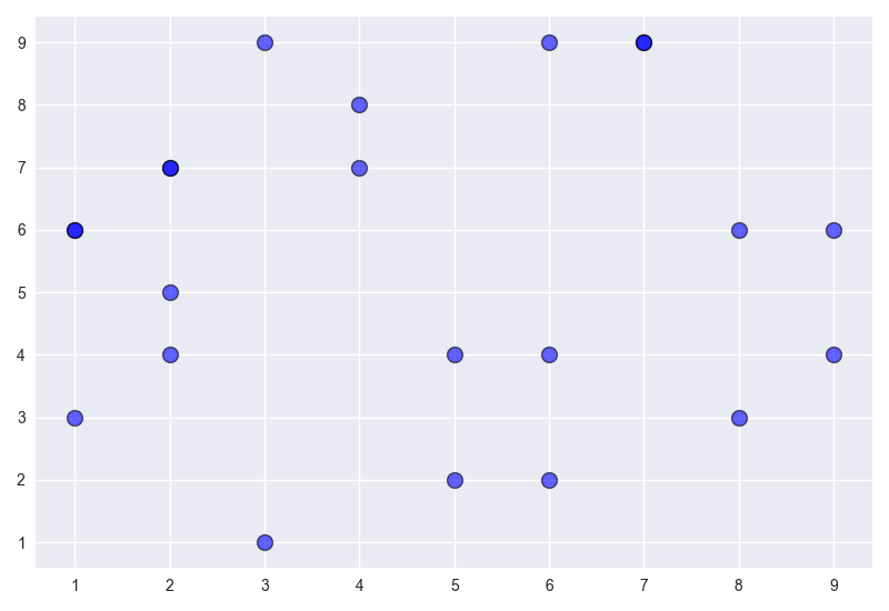
Creating a Simple Scatter Plot using Seaborn Style in Python
# scatter_plotting.py

import matplotlib.pyplot as plt

plt.style.use('seaborn')  # to get seaborn scatter plot

x = [2, 4, 6, 6, 9, 2, 7, 2, 6, 1, 8, 4, 5, 9, 1, 2, 3, 7, 5, 8, 1, 3]
y = [7, 8, 2, 4, 6, 4, 9, 5, 9, 3, 6, 7, 2, 4, 6, 7, 1, 9, 4, 3, 6, 9]


plt.scatter(x, y, s=100, alpha=0.6, c='blue', edgecolor='black', linewidth=1)
plt.tight_layout()
plt.show()
Adding colors to the scatter plot in Python depending on the value
We can also add scatter color by value to the matplotlib scatter plots. Let us assume that y values in the above random data for matplotlib scatter plots represent rating on the scale of 1-10. Now, we can pass a list of color having values 1-10
# scatter_plotting.py

colors = [7, 8, 2, 4, 6, 4, 9, 5, 9, 3, 6, 7, 2, 4, 6, 7, 1, 9, 4, 3, 6, 9]

plt.scatter(x, y, s=100, alpha=0.6, c=colors, edgecolor='black', linewidth=1)
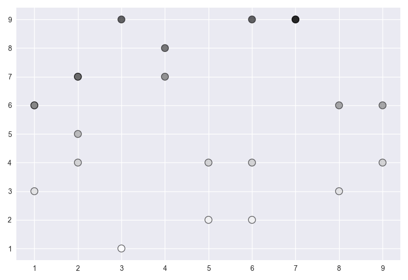
Now, in the above scatter plot, each marker is different shade of grey depending upon the value (1-10).
Using cmap to set colors of the Scatter Plots in Python
Instead of using the black color we can set some other color by passing cmap argument in plt.scatter(). Also we can set the label for the colorbar using the below python code. cmap can take the following values. You can read more about color maps to have different scatter plot colors for values here.
Accent, Accent_r, Blues, Blues_r, BrBG, BrBG_r, BuGn, BuGn_r, BuPu, BuPu_r, CMRmap, CMRmap_r, Dark2, Dark2_r, GnBu, GnBu_r, Greens, Greens_r, Greys, Greys_r, OrRd, OrRd_r, Oranges, Oranges_r, PRGn, PRGn_r, Paired, Paired_r, Pastel1, Pastel1_r, Pastel2, Pastel2_r, PiYG, PiYG_r, PuBu, PuBuGn, PuBuGn_r, PuBu_r, PuOr, PuOr_r, PuRd, PuRd_r, Purples, Purples_r, RdBu, RdBu_r, RdGy, RdGy_r, RdPu, RdPu_r, RdYlBu, RdYlBu_r, RdYlGn, RdYlGn_r, Reds, Reds_r, Set1, Set1_r, Set2, Set2_r, Set3, Set3_r, Spectral, Spectral_r, Wistia, Wistia_r, YlGn, YlGnBu, YlGnBu_r, YlGn_r, YlOrBr, YlOrBr_r, YlOrRd, YlOrRd_r, afmhot, afmhot_r, autumn, autumn_r, binary, binary_r, bone, bone_r, brg, brg_r, bwr, bwr_r, cividis, cividis_r, cool, cool_r, coolwarm, coolwarm_r, copper, copper_r, cubehelix, cubehelix_r, flag, flag_r, gist_earth, gist_earth_r, gist_gray, gist_gray_r, gist_heat, gist_heat_r, gist_ncar, gist_ncar_r, gist_rainbow, gist_rainbow_r, gist_stern, gist_stern_r, gist_yarg, gist_yarg_r, gnuplot, gnuplot2, gnuplot2_r, gnuplot_r, gray, gray_r, hot, hot_r, hsv, hsv_r, inferno, inferno_r, jet, jet_r, magma, magma_r, nipy_spectral, nipy_spectral_r, ocean, ocean_r, pink, pink_r, plasma, plasma_r, prism, prism_r, rainbow, rainbow_r, seismic, seismic_r, spring, spring_r, summer, summer_r, tab10, tab10_r, tab20, tab20_r, tab20b, tab20b_r, tab20c, tab20c_r, terrain, terrain_r, twilight, twilight_r, twilight_shifted, twilight_shifted_r, viridis, viridis_r, winter, winter_r
You can use any of these colors to make your scatter plot more colorful. This surely adds to data visualisation.
# scatter_plotting.py

plt.scatter(x, y, s=100, alpha=0.6, c=colors, edgecolor='black', linewidth=1, cmap='Blues')

cbar = plt.colorbar()
cbar.set_label('Rating (1-10)')
plt.tight_layout()
plt.show()
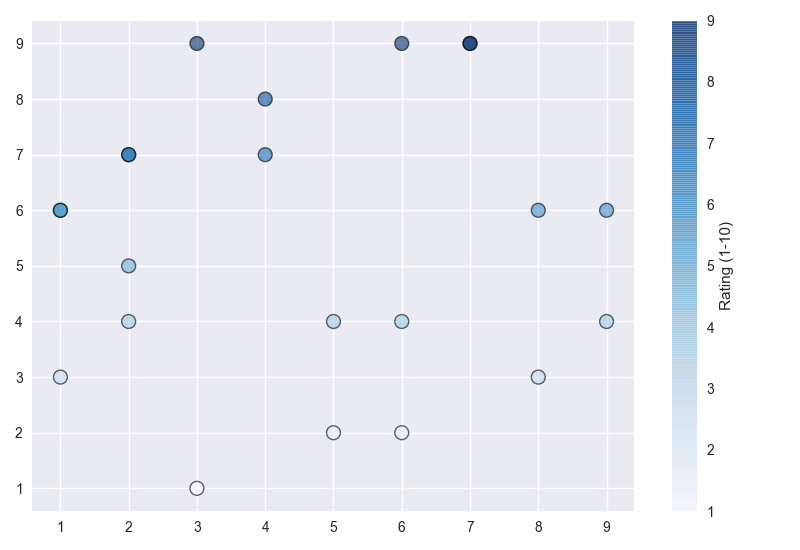
So, by using cmap we have converted our simple scatter plot in to colorful scatter plot. These matplotlib scatter plots help a lot in data visualisation. Now the scatter plot has colors as per the values.
Creating a Scatter plot using Python Pandas and Matplotlib
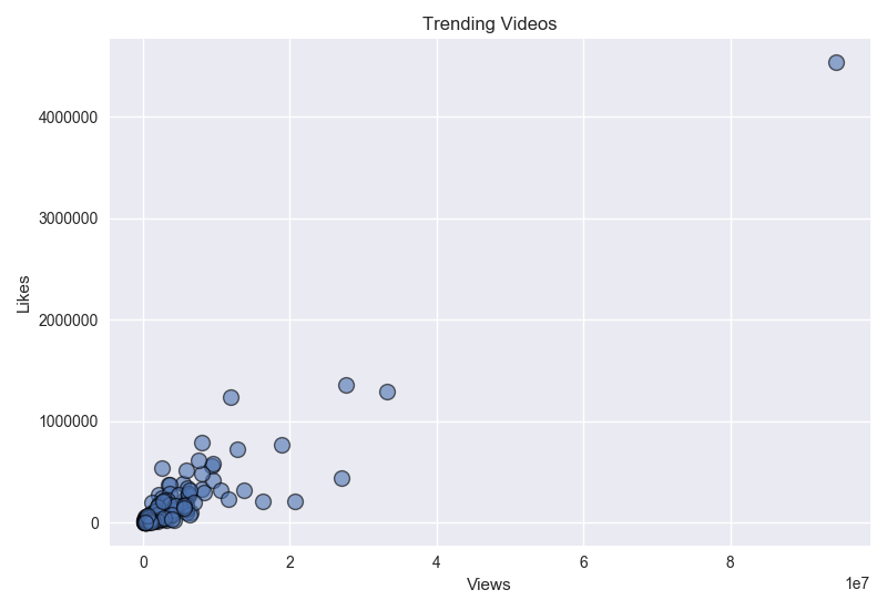
Now we will create a Matplotlib Scatter Plot from a CSV. For this I have grabbed the CSV from Corey Schaffer’s tutorial on Scatter Plots in Matplotlib from here.
The said example data file is about the views, likes and like/dislike ratio on the trending tutorial videos. Here we will plot this real time data as a scatter plot in Python. We will use pandas read_csv to extract the data from the csv and plot it. Now I have downloaded the said csv file and saved it as ‘scatter_plot_data.csv’ and have used the following code to create the scatter plot in matplotlib using python and pandas.
#scatter_plotting.py

import pandas as pd
import matplotlib.pyplot as plt

plt.style.use('seaborn')  # to get seaborn scatter plot

# read the csv file to extract data

data = pd.read_csv('scatter_plot_data.csv')
view_count = data['view_count']
likes = data['likes']
ratio = data['ratio']

plt.scatter(view_count, likes, s=100, alpha=0.6, edgecolor='black', linewidth=1)

plt.title('Trending Videos')
plt.xlabel('Views')
plt.ylabel('Likes')

plt.tight_layout()
plt.show()
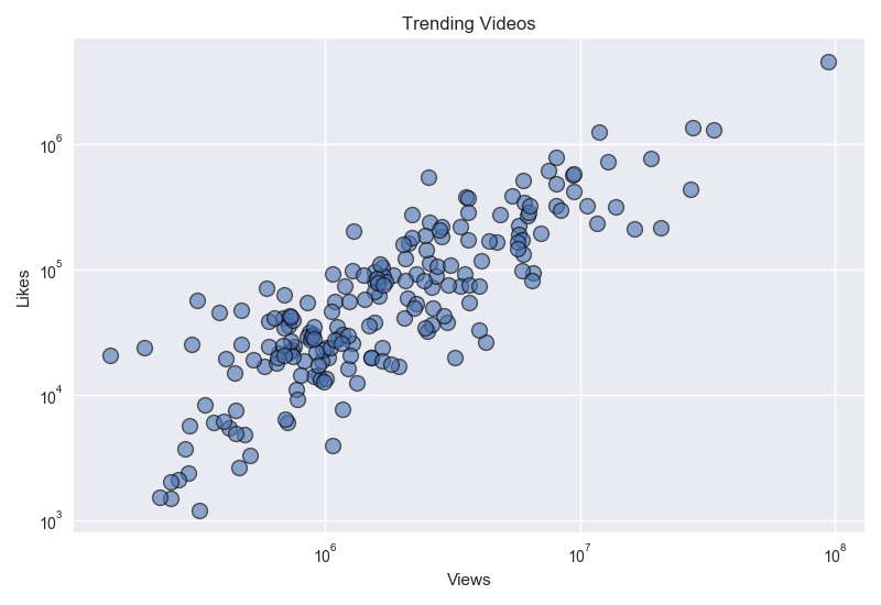
Creating a Logged Scatter Plot in Python
So, here you will see that our scatter plot has an outlier, as one of the videos has 40 lakh views. Due to this, the data is congested on the lower left of the scatter plot. We can either remove the outlier or instead of plotting it on the x and y scale we can plot it on the log scale using the following code.
# scatter_plotting.py

plt.xscale('log')
plt.yscale('log')

plt.show()
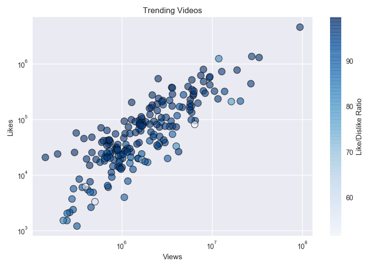
Finally we can integrate the like/dislike ratios in our scatter plot by using scatter plot colors on the basis of value of like/dislike ratio using colorbar.
# scatter_plotting.py

import pandas as pd
import matplotlib.pyplot as plt

plt.style.use('seaborn')  # to get seaborn scatter plot

# read the csv file to extract data

data = pd.read_csv('scatter_plot_data.csv')
view_count = data['view_count']
likes = data['likes']
ratio = data['ratio']

plt.scatter(view_count, likes, c=ratio, cmap="Blues", s=100, alpha=0.6, edgecolor='black', linewidth=1)

cbar = plt.colorbar()
cbar.set_label('Like/Dislike Ratio')

plt.xscale('log')
plt.yscale('log')
plt.title('Trending Videos')
plt.xlabel('Views')
plt.ylabel('Likes')

plt.tight_layout()
plt.show()
Matplotlib Video Tutorial Series
We are glad to inform you that we are coming up with the Video Tutorial Series of Matplotlib on Youtube. Check it out below.
Table of Contents of Matplotlib Tutorial in Python
Matplotlib Tutorial in Python | Chapter 1 | Introduction
Matplotlib Tutorial in Python | Chapter 2 | Extracting Data from CSVs and plotting Bar Charts
Pie Charts in Python | Matplotlib Tutorial in Python | Chapter 3
Matplotlib Stack Plots/Bars | Matplotlib Tutorial in Python | Chapter 4
Filling Area on Line Plots | Matplotlib Tutorial in Python | Chapter 5
Python Histograms | Matplotlib Tutorial in Python | Chapter 6
Scatter Plotting in Python | Matplotlib Tutorial | Chapter 7
Plot Time Series in Python | Matplotlib Tutorial | Chapter 8
Python Realtime Plotting | Matplotlib Tutorial | Chapter 9
Matplotlib Subplot in Python | Matplotlib Tutorial | Chapter 10
Python Candlestick Chart | Matplotlib Tutorial | Chapter 11
If you have liked our tutorial, there are various ways to support us, the easiest is to share this post. You can also follow us on facebook, twitter and youtube.
In case of any query, you can leave the comment below.
You can support us through patreon.